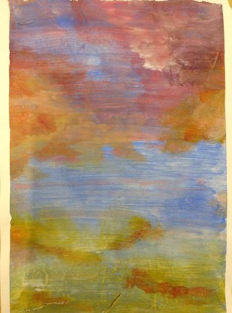
This week we tackled glazing and blending in acrylic. Instead of a still life, I suggested splitting up the paper into sections with masking tape in order for each box to be a different experiment. We used soft brushes in order to get a softer effect than is possible with the stiffer ones, and diluted the paint with water in order to build up translucent layers. It’s a great technique for making abstract patterns – I could imagine many of the results as…
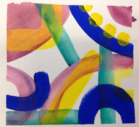
So again this week we were painting without brushes, this time with sponge brushes – actually pieces of foam stuck on a stick. We looked at the work of Howard Hodgkin for inspiration, as his broad brush strokes with multiple colours on them are exactly the effects that sponge brushes can do so easily. It’s particularly exciting when the colours mix on the sponge, and when you twist and twirl the brush. This is another technique in which giving yourself less control –…
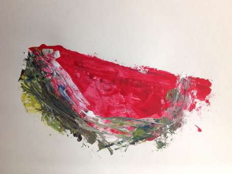
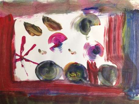
Did you know that although palette knives were used for centuries to mix paint it’s thought that it wasn’t until Rembrandt that artists actually thought to use them to apply the paint to the canvas? I suppose until then painters required the greater control that a paintbrush could give them, and the rough, scratchy marks a palette knife could give were not so interesting. More fool them I say because palette knives are amazing painting tools, as we demonstrated this week! Palette knives…
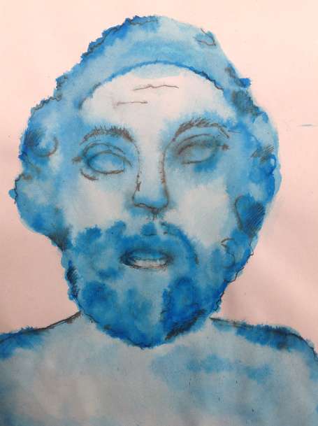
This term we are going back to basics and focusing on different painting or drawing tools. And this week it’s back to basics with our subject matter – classical sculptures. We have a few plaster casts in the studio, and I printed out some pictures of Greek and Roman statues to choose from. Taking inspiration from this Access Art session, I introduced the use of pen and ink – in which we find the shadows using a soft brush and coloured ink, using…
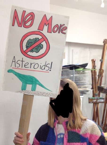
For the last week of term I decided to showcase all that the kids had learned about fonts, text and design and give them the freedom to promote any cause they wanted. They could make a placard (complete with cardboard stick!) or a poster, using paint, marker pens and/or collage. We had some brilliant designs, slogans,and causes, both earnest and joking.
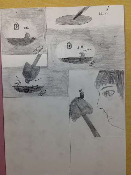
This week we looked into writing/drawing comics/graphic novels. We discussed how they manage to combine words and text together to create something that is more than the sum of it’s parts. I showed them how really the action in a comic happens between the boxes – the gutter – and in the imagination of the reader as the comics can only portray still images. But these still images can also use various tricks to convey movement – from movement lines, blurred images, blurred…

This week I asked the kids to make book covers. What book was up to them, and what age. I showed them some examples, and we talked about what makes a good cover, how you need to match the font to the style and content of the book, how book covers indicate for what age they are meant etc. And then of course, some weren’t satisfied with just a cover and made a whole book! Some of our older children wanted instead to…

This week I took inspiration from a painting by my grandmother, who was also an artist. She often worked with text, and in this painting she painted her letters in transparent layers so that the colours change when they overlap. The kids used coloured acetate to create a similar effect and, understandably for some, the technique suggested pictures or patterns rather than text.
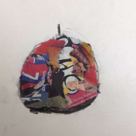
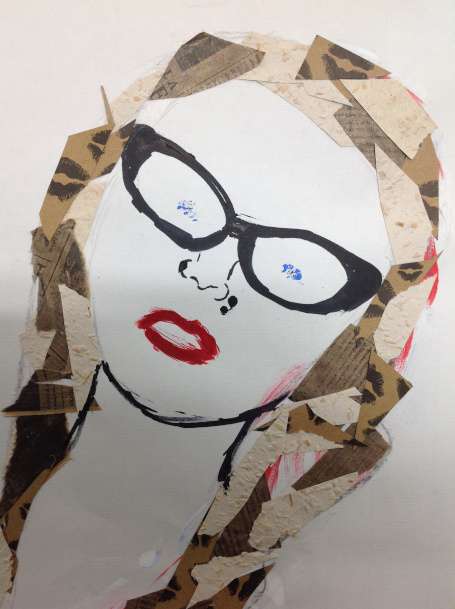
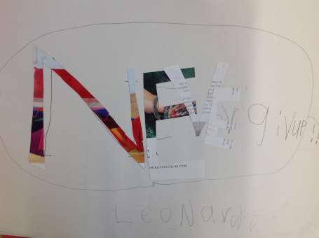
Continuing our theme of text, this time we used text (in the form of newspapers) for its different tonal values. Different sized text torn up will create different tonal shades – dark to light – and with that you have you palette and can create anything.Some also couldn’t resist adding a bit of colour from the newspapers! I assembled a group of fairly simple fruit, veg and white porcelain cups. As a warm up activity, we did ink and charcoal drawings of the…
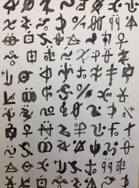
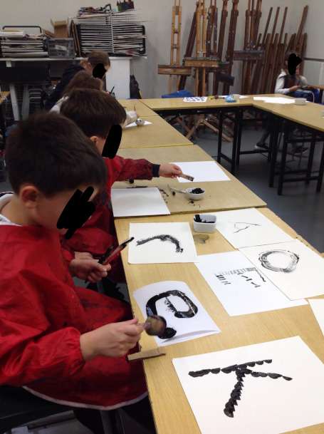
This week I introduced the kids to asemic writing – that is wriiting which has no intelligible meaning. It looks like script, or ideograms, with specific characters but yet those characters do not correspond to any actual symbols – hence the word asemic – non-signs. It’s amazing what can be conveyed trough signs, without those signs meaning anything – they are always full of energy and emotion. I came across this through the work of Henri Michaux. He was really interested in different…
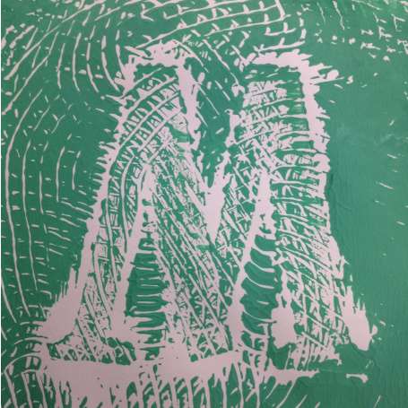
This week we we did block printing by sticking foam letters onto small pieces of wood. We then rolled printing ink onto them, stamped them and then repeated this several times to make a pattern. This could become a monogram but I also encouraged the kids to see the letters as simply shapes, rather than letters, and to see what kind of patterns they could create with them.Some even managed to make pictures with their letters!
The theme for this term’s classes is text. Artists have used text in a wide variety of ways, and not always legibly. Think of Picasso’s use of newspapers in his collages, or Michaux’s development of asemic writing (week 2). Of course then there is illustration which uses text as the inspiration and comic books which marry words and images to create something else. We will look at all these are more during this term. For our first session we focused on inventing our…
At the end of every summer term Art Class London puts on an exhibition of the work of all the students who attend our classes, young and old, experienced and beginners. We also have a private view – i.e. a party! Here are some pictures of the kids’ work on display.

foThe last two weeks of term we managed to build and paint spectacular houses, as well as finish off the hats, the transfers and anything else left finsihed ready for the exhibition next week. The houses were made with cotton fabric stiffened with PVA, a technique learned from fabric artist Angie Hughe. This was done before the class and left to dry outside in the sun. The result was a fabric that behaved more like card, so it could hold its shape, particularly…

This week we got to try out some millinery – using vilene (stiffened fabric), metal hair bands and sinamay (the net stuff that milliners use). AS well as my box of random fabrics. We had a wide range of designs from the pre-existing such as (tiny) top hats, witches hat and beefeater hats to the completely new such as the drooping swan and the fire hat. The stapler was invaluable here as a quick and easy way to attach the fabric without waiting…

Over two weeks (along with hat making – see my next post) the kids have been working with iron-on transfer dyes, also called disperse dyes. Here you paint onto paper and when it is dry you can iron what you’ve painted onto fabric. This is a great technique to play with as you do not have to simply transfer what you paint, you can cut it up, and mask areas when you are transferring – very much like printing. The first step is…
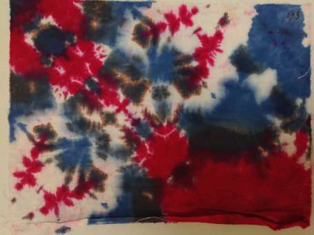
We were tying ourselves in knots this week – intentionally, and imaginatively. Different knots and folds, around different objects (such as small stones and lolly sticks), and with different ties (elastic bands or cable ties) created different and amazing effects. In order to ensure the dye is reasonably colourfast – i.e. the dye won’t all run out in the wash – I soaked the fabric (100% cotton) in soda ash first. You could add soda ash to the dye instead but this means…

This week we made our own looms out of cardboard (cut along two edges with pinking shears) and used them to weave amazing patterns using wool, fabric, threads, ribbons – all sorts! The colours the kids combined were fantastic. This activity suits those who like to work slowly – really getting into the zone – rather than those who are easily bored with repetitive activities. It’s also one for those who like working with different textures – all the results are just begging…

This week everyone did a lot of stabbing – though of course not themselves or each other. Needle felting works by repeatedly stabbing the fleece with a special, barbed felting needle. This mats the fibres together and the felt gradually takes on a shape or form. You can do this 2d on top of pre-felt (semi felted fabric) or 3d to make small forms (most made animals). Be careful to do the stabbing on top of a large sponge and be careful always…

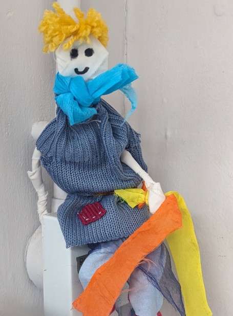
This week we used wire and fabric to make amazing sculptures. The idea came from Access Art but we didn’t use plinths this time, and the kids didn’t stick to people. The basic technique is to make a simple wire sculpture – e.g. a stick figure – and to cover it in strips of fabric ( I used a sheet from a charity shop). We used thin wire to keep wrapped around the fabric to keep it in place. Then they cut up…

This week we used glue instead of hot wax to form a resist against the acrylic paint. Originating in Indonesia, in batik hot wax would be poured on using a tjanting (a kind of tiny pot on a stick with a hole in the bottom). Then when the wax is dry and hard paint is applied onto the material and it won’t go wherever the wax is. You can build up layers this way, and whatever colour is beneath the wax will be…

So this term we are exploring textiles – including felting, dying, weaving, and even construction. To kick off we started with sewing, a fundamental skill so many are denied the opportunity to learn these days. And one that will come in handy throughout the rest of the term. This wasn’t sewing as a technical exercise – instead I encouraged the children to see the thread as another way to make a mark, just like with a pencil or a brush. The size, direction…
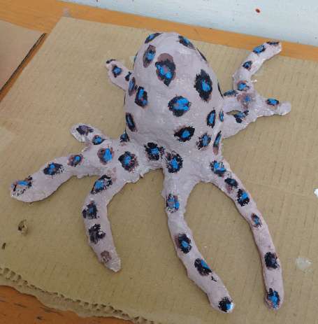
So it was the last week of term this week and the kids finished their paper clay sculptures, using either paint or torn paper (decoupage). I particularly loved the decoupaged ones which added a lovely texture, in keeping with the paper clay, as well as incorporating interesting patterns. But of course, the paint gave more control over the colours and texture. And some used both – see the goose and the perfume bottle! And one child even made a whole habitat for her…
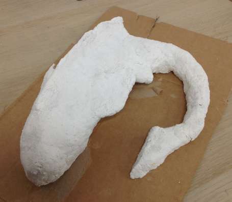
These two weeks we were busy with paper clay sculptures. Paper clay is a kind of paper mache, but the paper is mulched first before applying to the armature. I used this recipe from Jonni Good and it worked really well. The first step is to create the armature. What worked best was cardboard and scrunched up newspaper (careful to scrunch up the newspaper as tight as you can) but wire is also possible. Its really important that the sculpture is as tight…
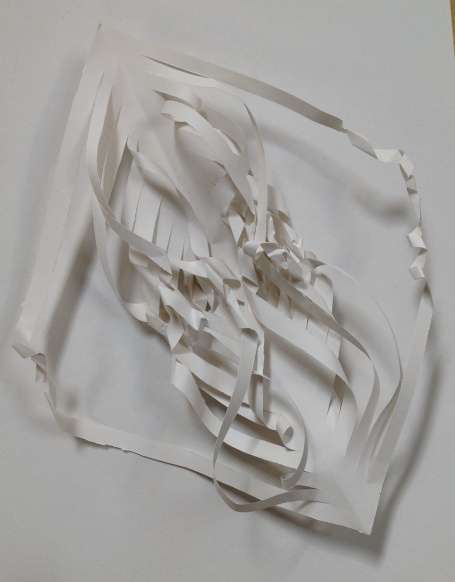
This week and I challenged everyone to make paper/card sculptures with no glue or sellotape – only stitches! We used Barbara Hepworth for inspiration, particularly her pieces involving holes and wire, and discussed how we could achieve similar effects using toilet rolls, card and thread, as well as a hole punch for the holes.. It really is amazing what shapes and forms can be created just by cutting, folding and stiching together. And while most went for abstract,,Mateo manged to make a fish!

This week the kids used all manner of pattern making techniques to create a wonderfully vibrant fashion catwalk – with cardboard human and other animal mannequins. The process was simple enough – but the results certainly weren’t. We had scarfs, saris, hats, capes, boots – you name it! Using techniques such as scarffito (sratching into wet paint to reveal a painted layer underneath) and stenciling they first made their ‘fabric’ by covering a piece of A4 paper with their pattern design. While these…